Raer
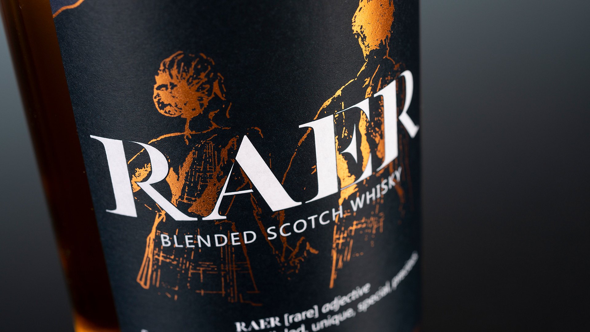
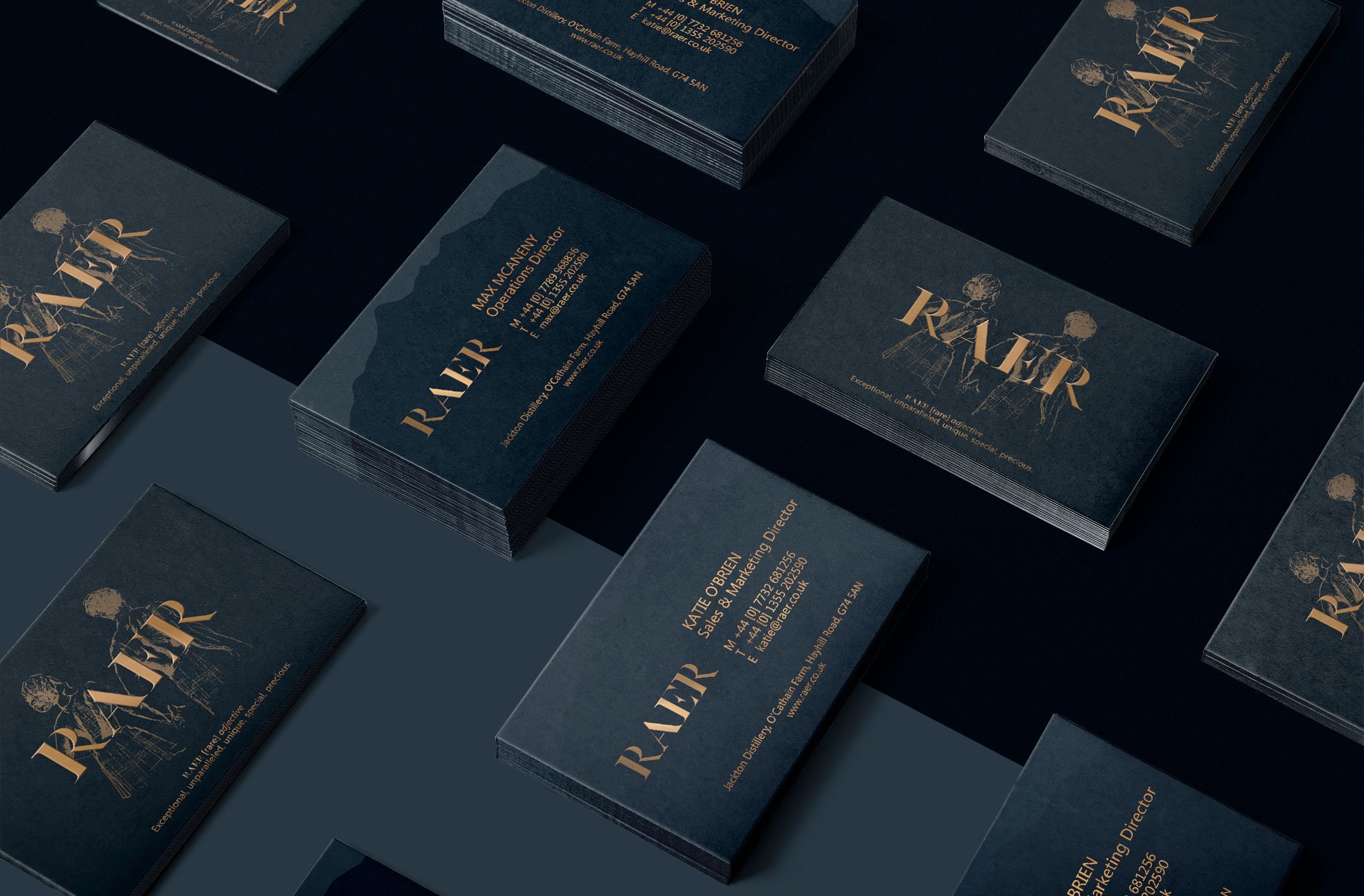
I designed the logo for Raer, a new distillery in Glasgow. Working with an illustrator who created the figures within the logo, I designed the labels for the bottle and worked with the printer on the client’s behalf.
Agency: Bauer Media
Creative Lead: Graeme McKellar
Illustrator: Chris Bryne
Website Design: Chris Harris
Photography: Raer Distillery
Project Overview
The client was looking to build their name in a highly-competitive market, dominated by heritage brands. For this they needed a label and logo design which would make them stand-out in the market, and on the shelf. With Whisky being a famously Scottish product, and wanting to increase sales internationally, the origin of the product needed to be readily-identifiable to buyers around the globe – whilst avoiding stereotypes or cliches.
Raer, like Scotland itself, is immensely proud of its origins – but always looking to the future. Therefor we sought to create a design that brought iconic Scottish imagery bang up to date. For the logo we created a hand-made design, based on the traditional ‘stencil’ font used on Whisky barrels for centuries, yet as unique as the name itself.


